Implementing master-detail layouts in Flutter
Usually, when developing apps for mobile phones, having too much screen real estate is not the problem. In fact, quite the contrary. Much thought has to be put into how to structure the app so that it does not feel cluttered. On tablets, it is a whole different story.
Let’s see what I am talking about through an example.
Result & source code
For the impatient, here’s what the result looks like on a mobile and tablet device:
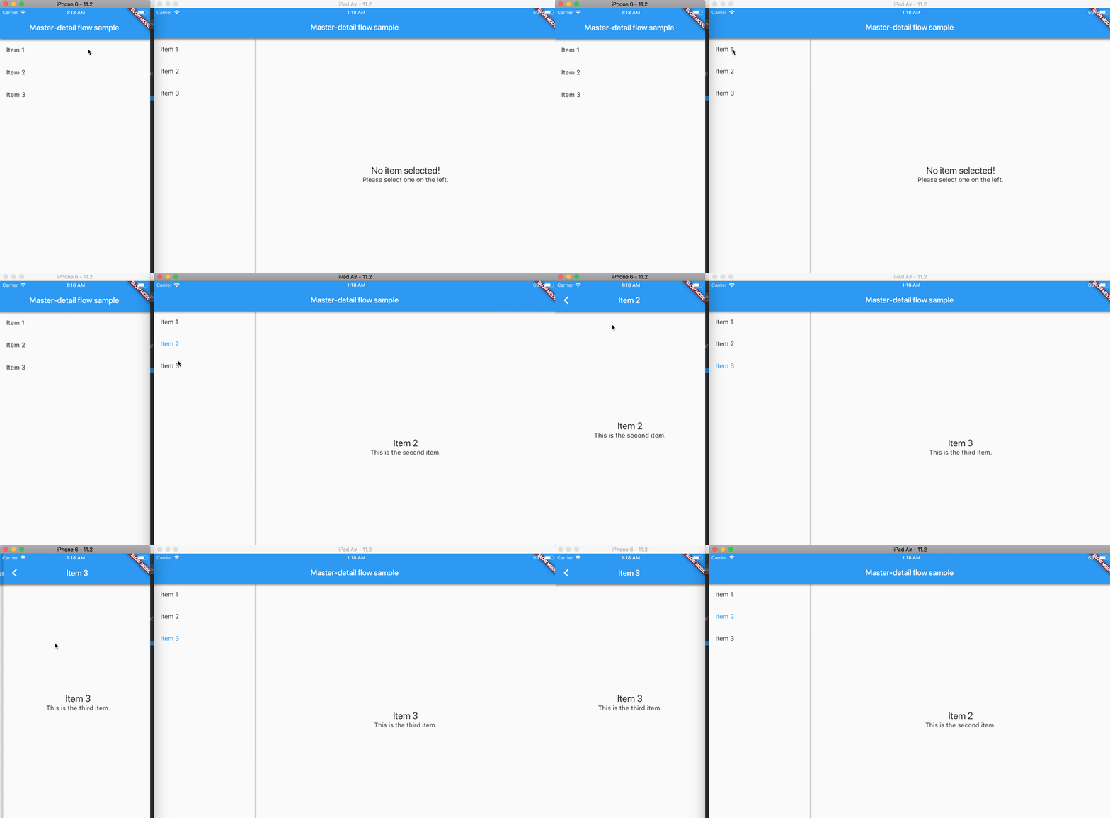
The source code is available here. If you get stuck, here is the entire git diff for what it took to convert the existing app to be adaptive.
The sample app
Our initial sample app is straightforward. It only has a screen with list items, and upon clicking one item, a details screen opens.
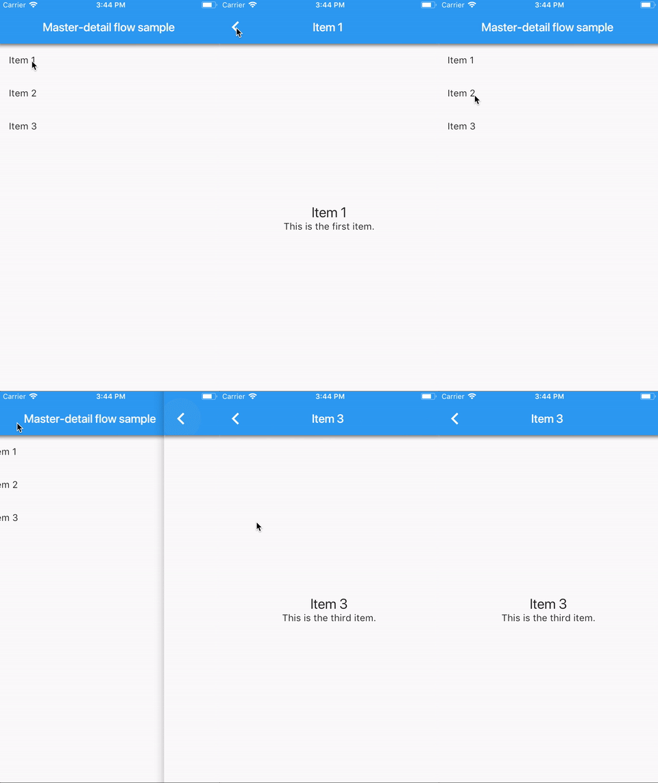
Although it is trivial, let’s take a look at the code. We have three files: the item model class, the item listing, and item details widgets.
class Item {
  Item({
    required this.title,
    required this.subtitle,
  });

  final String title;
  final String subtitle;
}

final items = <Item>[
  Item(
    title: 'Item 1',
    subtitle: 'This is the first item.',
  ),
  Item(
    title: 'Item 2',
    subtitle: 'This is the second item.',
  ),
  Item(
    title: 'Item 3',
    subtitle: 'This is the third item.',
  ),
];
We have a simple “PODO” (or Plain Old Dart Object) class representing an arbitrary item. It could be a list of social media posts, the user’s friends, anything. We will just have a boring nonimaginative name, which in this case is Item.
import 'item.dart';

class ItemListing extends StatelessWidget {
  ItemListing({
    required this.itemSelectedCallback,

    // The new argument we just added.
    this.selectedItem,
  });

  final ValueChanged<Item> itemSelectedCallback;
  final Item? selectedItem; // Also new.

  @override
  Widget build(BuildContext context) {
    return ListView(
      children: items.map((item) {
        return ListTile(
          title: Text(item.title),
          onTap: () => itemSelectedCallback(item),

          // Use the built-in "selected" argument on the ListTile.
          // It's a simple boolean denoting if the item is currently
          // selected or not.
          selected: selectedItem == item,
        );
      }).toList(),
    );
  }
}
The item listing screen has a simple ListView widget. Upon clicking an item, we get taken to an item details screen. To make it simple, we have the list of items statically constructed inline. In a real app, the item list would naturally come from a backend API.
We are not using the ListView.builder constructor here, since we only have three items. However, in a real app with an indefinite amount of list items, the builder approach is a must.
import 'package:meta/meta.dart';

import 'item.dart';

class ItemDetails extends StatelessWidget {
  ItemDetails({required this.item});
  final Item? item;

  @override
  Widget build(BuildContext context) {
    final textTheme = Theme.of(context).textTheme;
    final content = Column(
      mainAxisAlignment: MainAxisAlignment.center,
      children: [
        Text(
          item!.title,
          style: textTheme.headline5,
        ),
        Text(
          item!.subtitle,
          style: textTheme.subtitle1,
        ),
      ],
    );

    return Scaffold(
      appBar: AppBar(
        title: Text(item!.title),
      ),
      body: Center(child: content),
    );
  }
}
The item details screen is also quite simple. In its constructor, it takes in an item that was just selected and displays the title and subtitle in a centered Column widget.
Awesome. With such a little amount of code, we can produce a list of items and navigate to the correct item detail screen.
Let’s see how it looks on tablets.
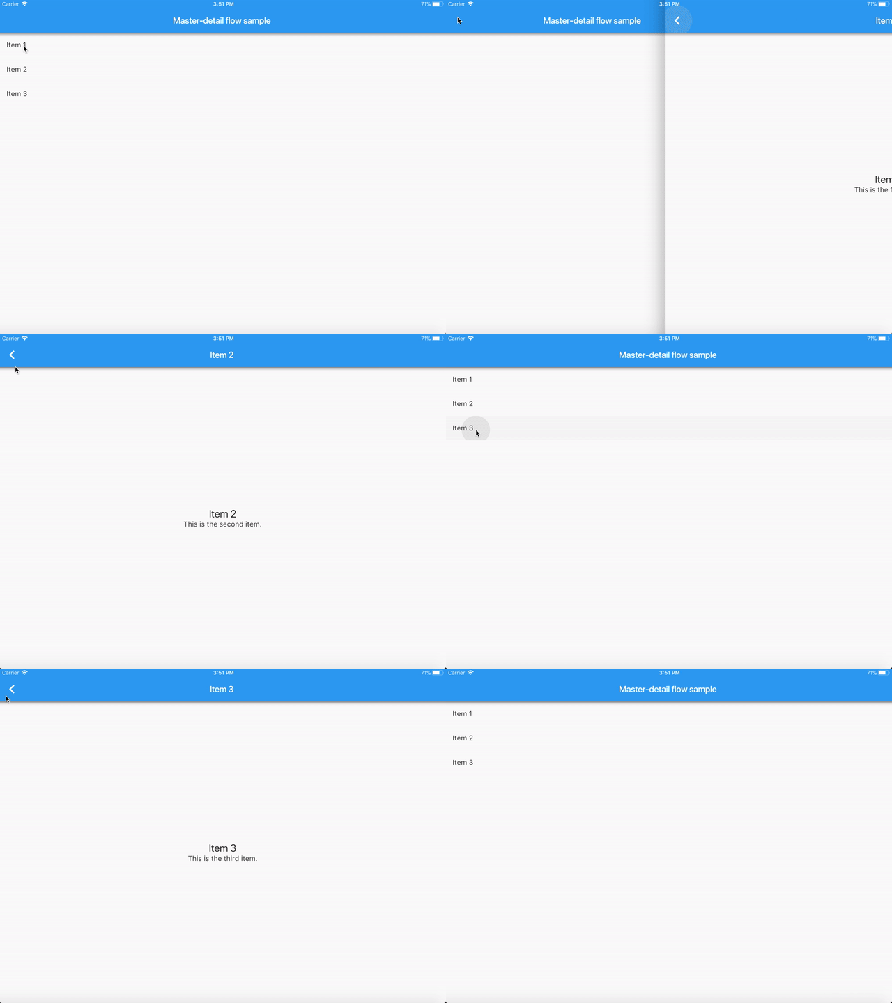
Ugh.
While that works, there’s a lot of unused screen real estate there. What’s the point of buying a tablet, if all we get is some more unused space?
Adapting to larger screen sizes
It is clear that we have to occupy the remaining space on tablets with something useful. Luckily, this is a problem that has already been solved before. On tablets, we can have the list of items on the left and the item detail view on the right.
Here is the explanatory graphic for the adaptive master-detail flow template in Android Studio:

On mobile phones, upon clicking on an item, we get taken to a separate detail view. However, on tablets, the left part of the screen contains a list of selectable items, and the right part acts as the detail view. When an item gets selected, the right detail view is replaced with new content.
Let’s take a look how to convert the previous app to work well with tablets.
Converting the existing code to be adaptive
Here’s what we know:
- when the user clicks a list item on mobile, we push a new route that contains the item details
- on larger screen size, clicking a list item should replace the detail view content on the right.
The solution is to wrap the ItemListing and ItemDetails widgets in a container widget which knows how to orchestrate everything.
Refactoring the ItemListing and ItemDetails widgets
To make our existing widgets handle tablet layouts, we must make some minimal changes.
Injecting the onTap callback to ItemListing widget
So, we know that the onTap callback has entirely different behavior on mobile and tablets. Sounds like a good use case for good old dependency injection, which is a fancy word for constructor arguments.
Let’s introduce a new constructor argument called itemSelectedCallback. This allows us to control the onTap callback behavior from the outside the widget.
import 'item.dart';

class ItemListing extends StatelessWidget {
  // Introduce a constructor which takes in a callback
  // to invoke when an item is selected.
  ItemListing({required this.itemSelectedCallback});
  final ValueChanged<Item> itemSelectedCallback;

  @override
  Widget build(BuildContext context) {
    return ListView(
      children: items.map((item) {
        return ListTile(
          title: Text(item.title),

          // Instead of defining our onTap callback here,
          // we forward the event to the callback defined
          // in our constructor argument.
          onTap: () => itemSelectedCallback(item),
        );
      }).toList(),
    );
  }
}
Now the widget blindly accepts any item tap callback that we provide. It does not even have even to know if it is in a tablet layout or not.
Making ItemDetails handle null items
In our case, on tablet layouts, no item is selected by default. Because of this, we will also have to handle null items. Thankfully, Dart’s null-aware operators make this a piece of cake.
Text(
  // Necessary handling for the case where an item is
  // not selected initially.
  item?.title ?? 'No item selected!',
  style: textTheme.headline5,
),
Text(
  // Same as above.
  item?.subtitle ?? 'Please select one on the left.',
  style: textTheme.subtitle1,
),
That is it! Our widgets are ready to be included in our new container widget. Also, the changes needed were minimal; we did not have to refactor our existing code entirely.
Creating the container Widget
With our ItemListing and ItemDetails widgets ready, we can now easily have different navigation behavior on tablets. The container widget can pass a different item tap callback depending on if we are on a mobile or tablet device.
Our initial draft for the container ends up being a StatefulWidget that has a state that looks something like this:
import 'package:flutter/material.dart';

import 'item.dart';
import 'item_details.dart';
import 'item_listing_inject.dart';

class MasterDetailContainer extends StatefulWidget {
  @override
  _MasterDetailContainerState createState() => _MasterDetailContainerState();
}

class _MasterDetailContainerState extends State<MasterDetailContainer> {
  // Track the currently selected item here. Only used for
  // tablet layouts.
  Item? _selectedItem;

  Widget _buildMobileLayout() {
    return ItemListing(
      // Since we're on mobile, just push a new route for the
      // item details.
      itemSelectedCallback: (item) {
        // Navigator.push(/* ... */);
      },
    );
  }

  Widget _buildTabletLayout() {
    // For tablets, return a layout that has item listing on the left
    // and item details on the right.
    return Row(
      children: [
        Flexible(
          flex: 1,
          child: ItemListing(
            // Instead of pushing a new route here, we update
            // the currently selected item, which is a part of
            // our state now.
            itemSelectedCallback: (item) {
              setState(() {
                _selectedItem = item;
              });
            },
          ),
        ),
        Flexible(
          flex: 3,
          child: ItemDetails(
            // The item details just blindly accepts whichever
            // item we throw in its way, just like before.
            item: _selectedItem,
          ),
        ),
      ],
    );
  }

  @override
  Widget build(BuildContext context) {
    if (useMobileLayout) {
      return _buildMobileLayout();
    }

    return _buildTabletLayout();
  }
}
You are probably wondering where the useMobileLayout boolean comes from. It is up to us to decide. In native Android development, we have screen size qualifiers. For our use case, the sw600dp qualifier is perfect, since that is the breakpoint for popular 7-inch Android tablets.
Bringing screen size qualifiers to Flutter
The equivalent of the “smallest width” qualifier on Android in Flutter is the shortestSide property of the screen, obtained by a MediaQuery.of(context) call. By comparing the shortestSide property to a standard breakpoint for tablet screens, we can determine if we should be displaying a mobile or tablet layout.
It turns out there are some seriously advanced algorithms involved to make our app handle mobile and tablet breakpoints easily.
// The equivalent of the "smallestWidth" qualifier on Android.
var smallestDimension = MediaQuery.of(context).size.shortestSide;

// Determine if we should use mobile layout or not. The
// number 600 here is a common breakpoint for a typical
// 7-inch tablet.
final useMobileLayout = smallestDimension < 600;
As you can see, the part about “seriously advanced algorithms” was sarcasm. It is dead simple. When we apply our knowledge so far, with a little refactoring, we should end up with something like this:
// ...
@override
Widget build(BuildContext context) {
  var shortestSide = MediaQuery.of(context).size.shortestSide;
  var useMobileLayout = shortestSide < 600;

  if (useMobileLayout) {
    return _buildMobileLayout();
  }

  return _buildTabletLayout();
}
So that is it for a working MVP of our adaptive layout! With only minor changes to our ItemListing and ItemDetails widgets, and introducing a new MasterDetailContainer widget, we get this:
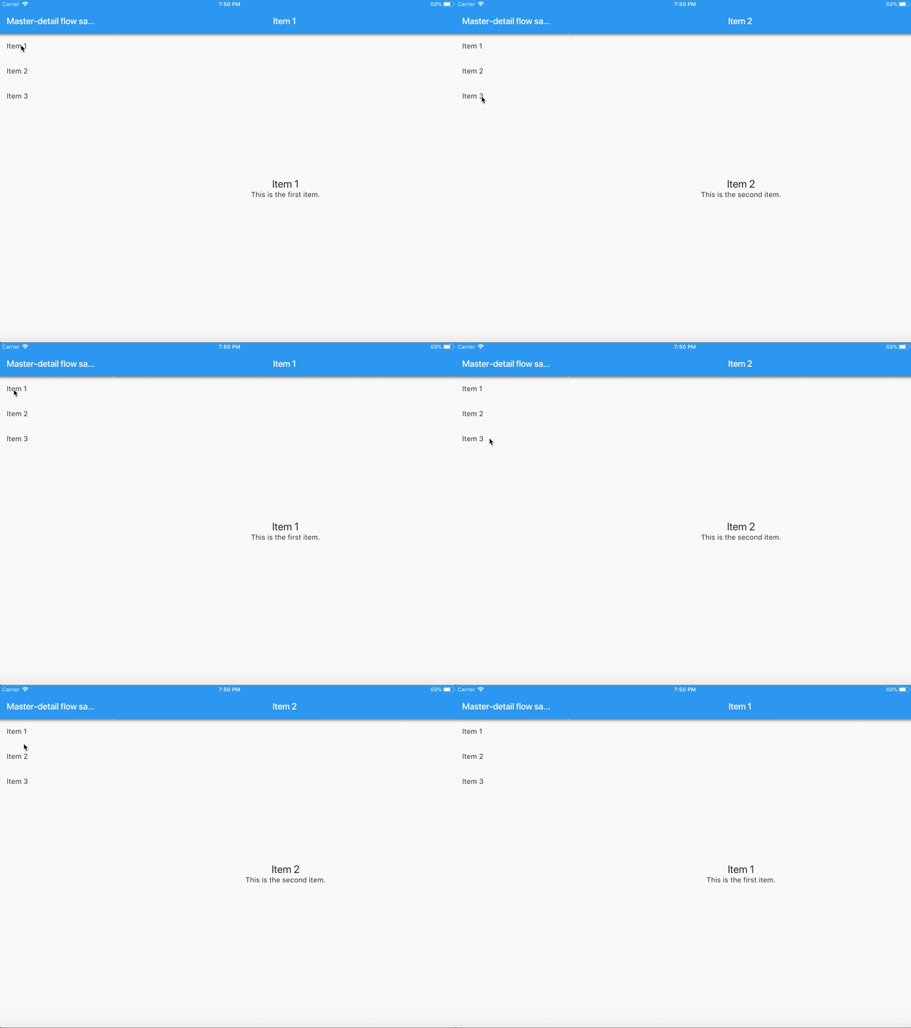
Although that is entirely functional, let’s make it even better.
Making it look good
If we look at the gif above, we can see there’s plenty of improvements to be made:
- indicating which item is currently selected in the list
- have a divider between the
ItemListingandItemDetailswidgets. - have a common
AppBarfor bothItemListingandItemDetails
Let’s make those improvements one by one.
Indicating the selected item in ItemListing widget
Remember how we previously added the onTap callback as the constructor argument? For indicating the currently selected item, we introduce another one. Let’s call this one selectedItem. Since it is not used for the mobile layouts, we will make it optional.
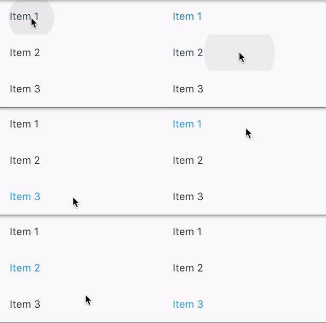
We can use the selected argument on the ListTile constructor to highlight the item when we want.
import 'item.dart';

class ItemListing extends StatelessWidget {
  ItemListing({
    required this.itemSelectedCallback,

    // The new argument we just added.
    this.selectedItem,
  });

  final ValueChanged<Item> itemSelectedCallback;
  final Item? selectedItem; // Also new.

  @override
  Widget build(BuildContext context) {
    return ListView(
      children: items.map((item) {
        return ListTile(
          title: Text(item.title),
          onTap: () => itemSelectedCallback(item),

          // Use the built-in "selected" argument on the ListTile.
          // It's a simple boolean denoting if the item is currently
          // selected or not.
          selected: selectedItem == item,
        );
      }).toList(),
    );
  }
}
Now we just pass the item around correctly in the container widget. Since we only highlight list items in tablet layouts, we only have to modify the _buildTabletLayout method:
// ...
Widget _buildTabletLayout() {
  return Row(
    children: [
      Flexible(
        flex: 1,
        child: ItemListing(
          itemSelectedCallback: (/* ... */) {/* ... */},

          // Simply passing the currently selected item down
          // to the ItemListing widget.
          selectedItem: _selectedItem,
        ),
      ),
      Flexible(
        flex: 3,
        child: ItemDetails(/* ... */),
      ),
    ],
  );
}
Done! After these changes, we should have something like this:
Common AppBar for ItemListing and ItemDetails
On mobile, both ItemListing and ItemDetails widgets have their own app bars, since they are two separate screens. On tablets, that is a different story. Like we saw in the gif before, having separate app bars for each widget does not look optimal.
Let’s introduce a constructor argument to the ItemDetails widget called isInTabletLayout.
// ...
ItemDetails({
  required this.isInTabletLayout,
  required this.item,
});

final bool isInTabletLayout;
final Item item;

@override
Widget build(BuildContext context) {
  final content = Column(/* ... */);

  if (isInTabletLayout) {
    // We're in master-detail layout as the detail view, so the
    // parent will provide the Scaffold and AppBar for us.
    return Center(child: content);
  }

  // Mobile layout. We're self-contained, so we provide our own
  // Scaffold and AppBar.
  return Scaffold(
    appBar: AppBar(
      title: Text(item.title),
    ),
    body: Center(child: content),
  );
}
The IDE should now complain about missing required constructor argument in two places: inside the _buildMobileLayout() and _buildTabletLayout() methods. For the mobile layout, we set the isInTabletLayout to false. For tablet layouts, we set it to true.
// ...
Widget _buildMobileLayout() {
  return ItemListing(
    itemSelectedCallback: (item) {
      // ...
      return ItemDetails(
        // The item details screen should provide
        // an AppBar of its own.
        isInTabletLayout: false,
        item: item,
      );
    },
  );
}

Widget _buildTabletLayout() {
  return Row(
    children: [
      // ...
      Flexible(
        flex: 3,
        child: ItemDetails(
          // The item details screen shouldn't provide
          // an AppBar of its own.
          isInTabletLayout: true,
          item: _selectedItem,
        ),
      ),
    ],
  );
}
This should now produce a unified AppBar on tablets, while keeping the old behavior on mobile phones:

Adding a divider between ItemListing and ItemDetails
This is probably the most straightforward modification to make. We just wrap the item listing widget inside a Material widget and provide an elevation. The elevation lifts the widget up, creating a shadow beneath it.
// ...
Widget _buildTabletLayout() {
  return Row(
    children: [
      Flexible(
        flex: 1,

        // Material widget with elevation set to 4.0 is
        // all we need for a good looking drop shadow.
        child: Material(
          elevation: 4.0,
          child: ItemListing(/* ... */),
        ),
      ),
      Flexible(
        flex: 3,
        child: ItemDetails(/* ... */),
      ),
    ],
  );
}
And we are done! If you followed all the steps, you should’ve ended up with different behavior on mobile and tablets, something like this:

If you missed it, the source code is available here. If you got stuck, here is the git diff what was required to convert existing app to be adaptive on tablets.
11 comments
likes