From design to Flutter #2 - Artist details page
It’s been a quite long time since the last post. Since I now figured out the ultimate way to finish articles, hopefully, I’ll be able to push some more content more often. Spoiler alert: it involves beer. (08/18/2018 update): No, I’m still slow writing articles. Seems like there’s no silver bullet for being lazy.
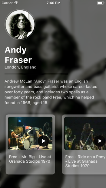
Today, we’re turning the beautiful artist profile page mockup by pramod into a real Flutter UI. For the mock data, we’re using one of my all-time favorite musicians, Andy Fraser, and a couple of the most amazing live performances he did with Free.
Here’s what the result looks like:
Without further ado, let’s go straight into it.
The sample project
The sample project is right here.
The starter project with assets
I’ve set up a starter branch where the resized assets have been included in a new app. This way you don’t have to deal with all the boilerplate of resizing images and creating model classes.
In a real-world scenario, all the images and content would come from a backend API. Since this tutorial is only focusing on the UI part, we use static assets.
The model classes are really simple; there’s only an Artist and a Video class.
Blurring the background image
Although we could just open Gimp or Photoshop and apply the blur effect there, we’re blurring the image using Flutter’s BackdropFilter combined with ImageFilter.blur. In a real-world scenario, it might be that we need the unblurred version of the image, and we don’t want to store two versions of the same asset.
import 'package:flutter/material.dart';

import 'models.dart';

class ArtistDetailsPage extends StatelessWidget {
  ArtistDetailsPage(this.artist);
  final Artist artist;

  @override
  Widget build(BuildContext context) {
    return Scaffold(
      body: Stack(
        fit: StackFit.expand,
        children: [
          Image.asset(artist.backdropPhoto, fit: BoxFit.cover),
          BackdropFilter(
            filter: ui.ImageFilter.blur(sigmaX: 5, sigmaY: 5),
            child: Container(
              color: Colors.black.withOpacity(0.5),
              // TODO: child: _buildContent(),
            ),
          ),
        ],
      ),
    );
  }
}
To achieve the blurred background effect, we:
- wrap the entire screen in a
Stackwidget withfitset toStackFit.expand - have the background image as the first child, with
fitset toBoxFit.cover - as the second child, have a
BackdropFilterwith thefilterset toImageFilter.blur.
As we know from previous tutorials, the Stack widget is used for putting widgets on top of each other. With StackFit.expand, all the non-positioned children will fill the entire Stack.
BackdropFilter applies a filter, in our case a blur effect, to existing content and then lays out the child. We also have a slightly transparent black color as a base for our content.
With this, we end up with a blurry background image:
That’s looking a little empty. Let’s add some content.
Setting up the general structure
To keep our indentation levels sane, let’s introduce a method called buildContent. Looking at the design, our content consists of three distinct sections that are stacked vertically:
- the circular avatar image
- the textual info, such as artist name, location, and biography
- the horizontal video scroller
We’ll want to wrap our content in a scroll view since there’s a chance that it will overflow on smaller screen sizes.
// ...
Widget _buildContent() {
  return SingleChildScrollView(
    child: Column(
      crossAxisAlignment: CrossAxisAlignment.start,
      children: [
        _buildAvatar(),
        _buildInfo(),
        _buildVideoScroller(),
      ],
    ),
  );
}

Widget _buildAvatar() {
  // TODO
  return Container();
}

Widget _buildInfo() {
  // TODO
  return Container();
}

Widget _buildVideoScroller() {
  // TODO
  return Container();
}
Let’s create all these widgets one by one.
Creating the circular avatar image
The circular avatar is probably my favorite part of this beautiful design. It’s a minimal and simple effect, yet it looks terrific.
So here’s what we know:
- the avatar is a circle, roughly 100px in size
- it has a slightly transparent 1px solid border
- there’s some padding between the border and the image.
With a little tinkering, we end up with the following code for our buildAvatar method:
// ...
Widget _buildAvatar() {
  return Container(
    width: 110,
    height: 110,
    decoration: BoxDecoration(
      shape: BoxShape.circle,
      border: Border.all(color: Colors.white30),
    ),
    margin: const EdgeInsets.only(top: 32, left: 16),
    padding: const EdgeInsets.all(3),
    child: ClipOval(
      child: Image.asset(artist.avatar),
    ),
  );
}
By setting the shape of the BoxDecoration to BoxShape.circle, all decoration elements will be drawn to a circular shape. In our case, this means the border.
To clip our image to a circle shape, we just wrap it in a ClipOval widget, which prevents its child from painting the usual straight corners.
When doing everything correctly, we end up with the result that looks like this:
Awesome! Now let’s populate the artist name, location, and biography into the UI.
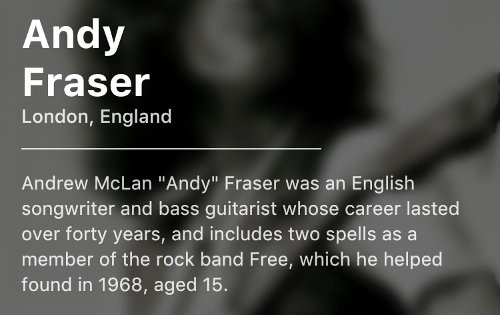
Creating the textual info section
This is probably the most straightforward one of these sections. It’s just some stylized Text widgets in a Column, with some padding around. The most interesting part here is probably the divider.
// ...
Widget _buildInfo() {
  return Padding(
    padding: const EdgeInsets.only(top: 16, left: 16, right: 16),
    child: Column(
      crossAxisAlignment: CrossAxisAlignment.start,
      children: [
        Text(
          artist.firstName + '\n' + artist.lastName,
          style: TextStyle(
            color: Colors.white,
            fontWeight: FontWeight.bold,
            fontSize: 30,
          ),
        ),
        Text(
          artist.location,
          style: TextStyle(
            color: Colors.white.withOpacity(0.85),
            fontWeight: FontWeight.w500,
          ),
        ),
        Container(
          color: Colors.white.withOpacity(0.85),
          margin: const EdgeInsets.symmetric(vertical: 16),
          width: 225,
          height: 1,
        ),
        Text(
          artist.biography,
          style: TextStyle(
            color: Colors.white.withOpacity(0.85),
            height: 1.4,
          ),
        ),
      ],
    ),
  );
}
The Container with a height of 1.0 is just merely the divider between the location and artist biography text.
This is what we end up with:
It’s mind-boggling that Andy was only 17 years old when he played this. Seriously, watch it. It’s the best way to spend a couple minutes of your time.
Creating the video scroller
This is easily the most involved part of this tutorial, but still nothing to get scared of. Dynamic lists in Flutter are much more concise than in native Android or iOS.
Setting up the horizontal list
We need a horizontal list that has undefined amount of items and scrolls in the horizontal axis. We’ll probably also want to have some padding around the items and top, so it’s not right below the artist information section.
// ...
Widget _buildVideoScroller() {
  return Padding(
    padding: const EdgeInsets.only(top: 16),
    child: SizedBox.fromSize(
      size: Size.fromHeight(245),
      child: ListView.builder(
        scrollDirection: Axis.horizontal,
        padding: const EdgeInsets.symmetric(horizontal: 8),
        itemCount: artist.videos.length,
        itemBuilder: (context, index) {
          var video = artist.videos[index];
          return VideoCard(video);
        },
      ),
    ),
  );
}
We’re using the ListView.builder constructor, since we could have an indefinite amount of videos. That way we’ll build the widgets for our items on demand, which is more efficient.
The reason we’re wrapping the list in a SizedBox is that otherwise it has unbounded height constraints. This means that our ListView will be of infinite height, and will result in an error.
Creating the video cards
Here’s what we start with:
import 'models.dart';

class VideoCard extends StatelessWidget {
  VideoCard(this.video);
  final Video video;

  BoxDecoration _buildShadowAndRoundedCorners() {
    // TODO
    return BoxDecoration();
  }

  Widget _buildThumbnail() {
    // TODO
    return Placeholder();
  }

  Widget _buildInfo() {
    // TODO
    return Placeholder();
  }

  @override
  Widget build(BuildContext context) {
    return Container(
      width: 175.0,
      padding: const EdgeInsets.all(8.0),
      margin: const EdgeInsets.symmetric(horizontal: 12.0, vertical: 16.0),
      decoration: _buildShadowAndRoundedCorners(),
      child: Column(
        crossAxisAlignment: CrossAxisAlignment.start,
        children: [
          Flexible(flex: 3, child: _buildThumbnail()),
          Flexible(flex: 2, child: _buildInfo()),
        ],
      ),
    );
  }
}
We’re using Flexible widgets with different flex factors to divide the available space. In this case, the thumbnail takes up 3/5 of the available space, which leaves 2/5 for the textual information. The magic number 5 here is simply the sum of all flex factors of the Flexible widgets in this Column.
Thanks to the Placeholder widget, we can already see the general outline of our video cards:
Now we just have to create the parts that make up our video card.
Styling the video card
By looking at the design, we can see that the video cards have a drop shadow and rounded corners.
To stylize our video cards, we use BoxDecorations, more specifically the borderRadius and boxShadow properties. We’ll also have a semi-transparent white background color.
// ...
BoxDecoration _buildShadowAndRoundedCorners() {
  return BoxDecoration(
    color: Colors.white.withOpacity(0.4),
    borderRadius: BorderRadius.circular(10),
    boxShadow: [
      BoxShadow(
        spreadRadius: 2,
        blurRadius: 10,
        color: Colors.black26,
      ),
    ],
  );
}
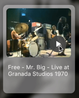
That gives us this look:
Let’s add the thumbnail images to our cards.
Building the video thumbnail and the play button
Remember how we used ClipOval to clip the avatar into a circle shape? The thumbnail will use a similar approach, except instead of ClipOval, we’ll use ClipRRect. A ClipRRect is a clipped round rectangle.
// ...
Widget _buildThumbnail() {
  return ClipRRect(
    borderRadius: BorderRadius.circular(8),
    child: Stack(
      children: [
        Image.asset(video.thumbnail),
        Positioned(
          bottom: 12,
          right: 12,
          child: _buildPlayButton(),
        ),
      ],
    ),
  );
}
By eyeballing the original design, we’ll end up with a radius of 8.0. Since the play button is positioned over the thumbnail, we’ll use a Stack widget.
// ...
Widget _buildPlayButton() {
  return Material(
    color: Colors.black87,
    type: MaterialType.circle,
    child: InkWell(
      onTap: () {
        // TODO
      },
      child: Padding(
        padding: const EdgeInsets.all(8),
        child: Icon(
          Icons.play_arrow,
          color: Colors.white,
        ),
      ),
    ),
  );
}
The play button is just an Icon with some padding, wrapped in an InkWell which is wrapped in a Material widget.
InkWell draws a ripple touch response, but in our case, it needs a direct Material ancestor. Otherwise, the ripple will be drawn but we don’t see it, since the nearest Material to draw on is in the main Scaffold and we have overlapping content on top of that.
Almost done! Finally, the easiest part of these video cards.
Building the video info text
This is probably the most simple one of these. It’s just a Text widget with some padding around it.
// ...
Widget _buildInfo() {
  return Padding(
    padding: const EdgeInsets.only(top: 16, left: 4, right: 4),
    child: Text(
      video.title,
      style: TextStyle(color: Colors.white.withOpacity(0.85)),
    ),
  );
}
And we’re done!
Bonus: opening the video links
It doesn’t make a lot of sense without the play buttons actually opening those videos, does it? Let’s change that.
To open links, we can use the first-party url_launcher plugin.
First, we add the dependency to our pubspec file, in the dependencies block:
dependencies:
  ...
  url_launcher: ^2.0.2
To fetch the new dependency, we can run flutter packages get or click Packages get in our IDE.
After that, integrating the plugin is really straightforward:
import 'package:url_launcher/url_launcher.dart';

// ...
Widget _buildPlayButton() {
  return Material(
    // ...
    child: InkWell(
      onTap: () async {
        if (await canLaunch(video.url)) {
          await launch(video.url);
        }
      },
      child: Container(/* ... */),
    ),
  );
}
Now we have a fancy artist details page that can open the video links.
If you missed it, the sample app is here.
Newsletter
Get notified if/when I publish something new. Or use the feed with your favorite RSS reader. Your choice.