From design to Flutter #1 - Movie Details Page
Welcome to a new series called From Wireframes to Flutter! On this series, we’ll take inspiration from UI mockups, turn them into Flutter layouts and break down the components piece by piece.
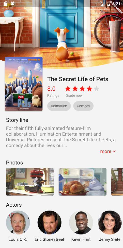
To kick this thing off, we’ll start with a mockup called “Movie” by LEON.W on Dribbble. We’ll focus only on the movie details screen, hence the title of this article.
The sample project
The sample project is right here.
The models
I created a Movie class for holding the information about the movie. Similarly, I also made an Actor class for holding the actors’ name and avatar url. These are simply passed to our UI components so they know what to show.
For sample purposes, I created a single file that holds all the models needed about the movie, according to the original design.
  Movie({
    this.bannerUrl,
    this.posterUrl,
    this.title,
    this.rating,
    this.starRating,
    this.categories,
    this.storyline,
    this.photoUrls,
    this.actors,
  });

  final String? bannerUrl;
  final String? posterUrl;
  final String? title;
  final double? rating;
  final int? starRating;
  final List<String>? categories;
  final String? storyline;
  final List<String>? photoUrls;
  final List<Actor>? actors;
}

class Actor {
  Actor({
    this.name,
    this.avatarUrl,
  });

  final String? name;
  final String? avatarUrl;
}
The data source
We aren’t going to hook our app with a live movie API. Working with APIs is a topic of its own and out of scope for this article. Instead, I just made an instance of the Movie class and filled it with the same information the mockup has.
final testMovie = Movie(
  bannerUrl: 'images/banner.png',
  posterUrl: 'images/poster.png',
  title: 'The Secret Life of Pets',
  rating: 8.0,
  starRating: 4,
  categories: ['Animation', 'Comedy'],
  storyline: 'For their fifth fully-animated feature-film '
      'collaboration, Illumination Entertainment and Universal '
      'Pictures present The Secret Life of Pets, a comedy about '
      'the lives our...',
  photoUrls: [
    'images/1.png',
    'images/2.png',
    'images/3.png',
    'images/4.png',
  ],
  actors: [
    Actor(
      name: 'Louis C.K.',
      avatarUrl: 'images/louis.png',
    ),
    Actor(
      name: 'Eric Stonestreet',
      avatarUrl: 'images/eric.png',
    ),
    Actor(
      name: 'Kevin Hart',
      avatarUrl: 'images/kevin.png',
    ),
    Actor(
      name: 'Jenny Slate',
      avatarUrl: 'images/jenny.png',
    ),
    Actor(
      name: 'Ellie Kemper',
      avatarUrl: 'images/ellie.png',
    ),
  ],
);
This allows us to easily use the testMovie as the source of data anywhere in our app. We’ll also get up to speed pretty quickly, since we don’t have to worry about networking here.
Our main.dart file
This is the main entry point for our app. There’s nothing fancy here, I just made the MovieDetailsPage to be the only page this app has.
import 'movie_api.dart';
import 'movie_details_page.dart';

void main() => runApp(MyApp());

class MyApp extends StatelessWidget {
  @override
  Widget build(BuildContext context) {
    return MaterialApp(
      title: 'Flutter Demo',
      theme: ThemeData(
        primarySwatch: Colors.blue,
        accentColor: const Color(0xFFFF5959),
      ),
      home: MovieDetailsPage(testMovie),
    );
  }
}
On a real world use case, we would probably want to display a list of movies as a first page. The MovieDetailsPage would be shown after the user clicks a movie in order to, you know, view the movie details. For this tutorial, we’re only focusing on the movie details page UI, so this is completely fine.
The MovieDetailsPage class
This is the main entry point for our movie details screen. MovieDetailsPage takes a Movie object as a constructor parameter, and passes that down for its subcomponents. This way we can hook the page easily to a backend later.
import 'actor_scroller.dart';
import 'models.dart';
import 'movie_detail_header.dart';
import 'photo_scroller.dart';
import 'storyline.dart';

class MovieDetailsPage extends StatelessWidget {
  MovieDetailsPage(this.movie);
  final Movie movie;

  @override
  Widget build(BuildContext context) {
    return Scaffold(
      body: SingleChildScrollView(
        child: Column(
          children: [
            MovieDetailHeader(movie),
            Padding(
              padding: const EdgeInsets.all(20.0),
              child: Storyline(movie.storyline),
            ),
            PhotoScroller(movie.photoUrls),
            SizedBox(height: 20.0),
            ActorScroller(movie.actors),
            SizedBox(height: 50.0),
          ],
        ),
      ),
    );
  }
}
Although the page is contained within a Scaffold, we don’t use an AppBar here, since we want to display our movie background in all of its glory. The body is just a Column which stacks our main widgets vertically. Finally, the whole thing is wrapped in a SingleChildScrollView. For vertical margins, we use SizedBoxes with heights that we want our spacing to be.
Let’s go through each component one by one and see what they’re made of.
MovieDetailHeader
The MovieDetailHeader is a simple Stack widget that hosts two Widgets as its children. A Stack is a container that lays its children on top of each other. The first child is the arc background image, and second one a Row widget, containing the poster and information about the movie.
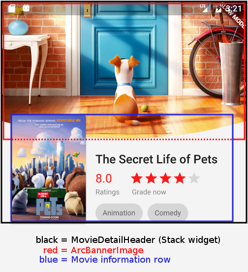
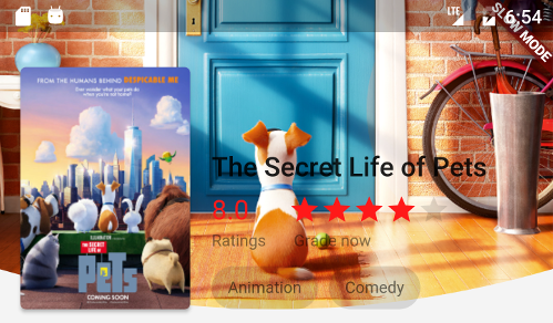
Since the original mockup had the movie banner partially overlaid by the movie information, we use a little trick here: the ArcBannerImage has a bottom padding of 140.0.
This simply stretches the available space on the bottom, so we can partially overlay the banner with the movie information. Without this trick, movie information would get on placed on top of the entire banner, resulting in a quite ugly effect:
We use the Positioned widget, which is specific to only Stack, to position our movie information at the bottom. The movie information Row consists of two items: the movie poster and further information about the movie, which is a Column.
import 'arc_banner_image.dart';
import 'models.dart';
import 'poster.dart';
import 'rating_information.dart';

class MovieDetailHeader extends StatelessWidget {
  MovieDetailHeader(this.movie);
  final Movie movie;

  List<Widget> _buildCategoryChips(TextTheme textTheme) {
    return movie.categories!.map((category) {
      return Padding(
        padding: const EdgeInsets.only(right: 8.0),
        child: Chip(
          label: Text(category),
          labelStyle: textTheme.caption,
          backgroundColor: Colors.black12,
        ),
      );
    }).toList();
  }

  @override
  Widget build(BuildContext context) {
    var textTheme = Theme.of(context).textTheme;

    var movieInformation = Column(
      crossAxisAlignment: CrossAxisAlignment.start,
      children: [
        Text(
          movie.title!,
          style: textTheme.headline6,
        ),
        SizedBox(height: 8.0),
        RatingInformation(movie),
        SizedBox(height: 12.0),
        Row(children: _buildCategoryChips(textTheme)),
      ],
    );

    return Stack(
      children: [
        Padding(
          padding: const EdgeInsets.only(bottom: 140.0),
          child: ArcBannerImage(movie.bannerUrl),
        ),
        Positioned(
          bottom: 0.0,
          left: 16.0,
          right: 16.0,
          child: Row(
            crossAxisAlignment: CrossAxisAlignment.end,
            mainAxisAlignment: MainAxisAlignment.end,
            children: [
              Poster(
                movie.posterUrl,
                height: 180.0,
              ),
              SizedBox(width: 16.0),
              Expanded(child: movieInformation),
            ],
          ),
        ),
      ],
    );
  }
}
The Column contains three children: the title of the movie, the rating information and category chips. Yes, chips. Yummy!
One thing to note is that we use the Expanded widget here. Without it, a longer movie title would get clipped. We also use a little padding on the left, so that the poster and movie information are not right next to each other.
ArcBannerImage
Having read the last weeks’ post about clipping images with bezier curves, this should be nothing new to us.
Here’s the end and control points for reference.
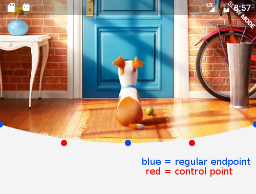
After fiddling around a little bit, this turned out to be even simpler than the last time.
It’s the same old ClipPath and CustomClipper dance we did the last time. Since the fine details of this have been already covered in the previous post, we won’t go through those again.
class ArcBannerImage extends StatelessWidget {
  ArcBannerImage(this.imageUrl);
  final String? imageUrl;

  @override
  Widget build(BuildContext context) {
    var screenWidth = MediaQuery.of(context).size.width;

    return ClipPath(
      clipper: ArcClipper(),
      child: Image.asset(
        imageUrl!,
        width: screenWidth,
        height: 230.0,
        fit: BoxFit.cover,
      ),
    );
  }
}

class ArcClipper extends CustomClipper<Path> {
  @override
  Path getClip(Size size) {
    var path = Path();
    path.lineTo(0.0, size.height - 30);

    var firstControlPoint = Offset(size.width / 4, size.height);
    var firstPoint = Offset(size.width / 2, size.height);
    path.quadraticBezierTo(firstControlPoint.dx, firstControlPoint.dy,
        firstPoint.dx, firstPoint.dy);

    var secondControlPoint = Offset(size.width - (size.width / 4), size.height);
    var secondPoint = Offset(size.width, size.height - 30);
    path.quadraticBezierTo(secondControlPoint.dx, secondControlPoint.dy,
        secondPoint.dx, secondPoint.dy);

    path.lineTo(size.width, 0.0);
    path.close();

    return path;
  }

  @override
  bool shouldReclip(CustomClipper<Path> oldClipper) => false;
}
The only thing to remember here is that we get the image source from outside the class in the imageUrl constructor parameter. This makes it easy to control what image should be shown, from the outside.
Also we’re setting the image width to equal the screen width. Combined with BoxFit.cover, this makes our image look decent on different screen sizes.
Poster
I decided to make the poster to be in a separate class. Why? Because the poster has to always have a specific aspect ratio. If we give it a height, it should automatically resolve its width.
To show an image in our layout, we must know the source of the image we want to show. You guessed it, the Poster class needs to recieve a posterUrl in its constructor parameter. Our posters should also have rounded corners and a nice little drop shadow.
class Poster extends StatelessWidget {
  static const POSTER_RATIO = 0.7;

  Poster(
    this.posterUrl, {
    this.height = 100.0,
  });

  final String? posterUrl;
  final double height;

  @override
  Widget build(BuildContext context) {
    var width = POSTER_RATIO * height;

    return Material(
      borderRadius: BorderRadius.circular(4.0),
      elevation: 2.0,
      child: Image.asset(
        posterUrl!,
        fit: BoxFit.cover,
        width: width,
        height: height,
      ),
    );
  }
}
To achieve the rounded corners and the drop shadow effect in the simplest way possible, we use the Material widget. The drop shadow intensity is controlled by the elevation property.
We want the poster to fill the entire available area it’s given, but without distorting the image proportions. BoxFit.cover does exactly that. The POSTER_RATIO is 0.7 just because it looks to be something similar according to the mockup.
RatingInformation
The rating information widget is a Row, which is simply a container that lays its children horizontally. The row has two children, which both are Columns that are used for laying children vertically. The first child of each column is the rating information part, and the second child is the caption text.
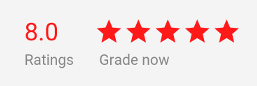
The first part of the rating information widget is just a Text, displaying a current rating as a number. We also have an actual star rating bar that displays the star rating for the movie.
I actually don’t know why the original mockup has two rating elements, but I was way too far to go back and choose something else.
import 'models.dart';

class RatingInformation extends StatelessWidget {
  RatingInformation(this.movie);
  final Movie movie;

  Widget _buildRatingBar(ThemeData theme) {
    var stars = <Widget>[];

    for (var i = 1; i <= 5; i++) {
      var color = i <= movie.starRating! ? theme.accentColor : Colors.black12;
      var star = Icon(
        Icons.star,
        color: color,
      );

      stars.add(star);
    }

    return Row(children: stars);
  }

  @override
  Widget build(BuildContext context) {
    var theme = Theme.of(context);
    var textTheme = theme.textTheme;
    var ratingCaptionStyle = textTheme.caption!.copyWith(color: Colors.black45);

    var numericRating = Column(
      crossAxisAlignment: CrossAxisAlignment.start,
      mainAxisAlignment: MainAxisAlignment.spaceBetween,
      children: [
        Text(
          movie.rating.toString(),
          style: textTheme.headline6!.copyWith(
            fontWeight: FontWeight.w400,
            color: theme.accentColor,
          ),
        ),
        SizedBox(height: 4.0),
        Text(
          'Ratings',
          style: ratingCaptionStyle,
        ),
      ],
    );

    var starRating = Column(
      crossAxisAlignment: CrossAxisAlignment.start,
      mainAxisAlignment: MainAxisAlignment.spaceBetween,
      children: [
        _buildRatingBar(theme),
        Padding(
          padding: const EdgeInsets.only(top: 4.0, left: 4.0),
          child: Text(
            'Grade now',
            style: ratingCaptionStyle,
          ),
        ),
      ],
    );

    return Row(
      crossAxisAlignment: CrossAxisAlignment.end,
      children: [
        numericRating,
        SizedBox(width: 16.0),
        starRating,
      ],
    );
  }
}
The star rating is an integer between 1-5, and we just loop from 1 to 5, adding star icons to our list of star widgets as we go. If the current position in the loop is less than or equal the star rating, we colorize the star icon. Otherwise, we’ll just set it to a fairly transparent black color.
Storyline
The storyline widget is probably the most simple one. It’s a Column widget, containing the title and storyline Text widgets. There’s also the “more” button, aligned at the bottom right corner below the storyline text.
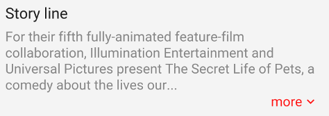
I know, I know, the “more” button is in a different place than on the original mockup! It’s this way because of purely practical reasons.
Determining where the text gets clipped off and placing the “more” button right after it is hard. It’s most likely doable, but would cost us more time for no extra value in the end.
class Storyline extends StatelessWidget {
  Storyline(this.storyline);
  final String? storyline;

  @override
  Widget build(BuildContext context) {
    var theme = Theme.of(context);
    var textTheme = Theme.of(context).textTheme;

    return Column(
      crossAxisAlignment: CrossAxisAlignment.start,
      children: [
        Text(
          'Story line',
          style: textTheme.subtitle1!.copyWith(fontSize: 18.0),
        ),
        SizedBox(height: 8.0),
        Text(
          storyline!,
          style: textTheme.bodyText2!.copyWith(
            color: Colors.black45,
            fontSize: 16.0,
          ),
        ),
        // No expand-collapse in this tutorial, we just slap the "more"
        // button below the text like in the mockup.
        Row(
          mainAxisAlignment: MainAxisAlignment.end,
          crossAxisAlignment: CrossAxisAlignment.end,
          children: [
            Text(
              'more',
              style: textTheme.bodyText2!
                  .copyWith(fontSize: 16.0, color: theme.accentColor),
            ),
            Icon(
              Icons.keyboard_arrow_down,
              size: 18.0,
              color: theme.accentColor,
            ),
          ],
        ),
      ],
    );
  }
}
One thing to note is that we don’t implement expand-collapse functionality in this article. We’re just duplicating the UI and layout. If you’d like for a quick article on explaining how to integrate nice looking expand-collapse functionality, go ahead and leave a comment!
PhotoScroller
This is the Widget responsible for displaying the screenshots of the movie.
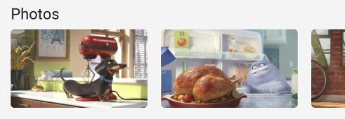
It uses a horizontal ListView with the builder approach. The ListView.builder is used for displaying long lists of data with good performance. It’s especially useful if you load something from a server and don’t know how many items you may get.
The builder is called every time a new item is going to be showed on screen. The items are built on-demand instead of keeping every needed Widget in memory all times. This is more or less an equivalent of RecyclerView on Android and UITableView on iOS.
class PhotoScroller extends StatelessWidget {
  PhotoScroller(this.photoUrls);
  final List<String>? photoUrls;

  Widget _buildPhoto(BuildContext context, int index) {
    var photo = photoUrls![index];

    return Padding(
      padding: const EdgeInsets.only(right: 16.0),
      child: ClipRRect(
        borderRadius: BorderRadius.circular(4.0),
        child: Image.asset(
          photo,
          width: 160.0,
          height: 120.0,
          fit: BoxFit.cover,
        ),
      ),
    );
  }

  @override
  Widget build(BuildContext context) {
    var textTheme = Theme.of(context).textTheme;

    return Column(
      crossAxisAlignment: CrossAxisAlignment.start,
      children: [
        Padding(
          padding: const EdgeInsets.symmetric(horizontal: 20.0),
          child: Text(
            'Photos',
            style: textTheme.subtitle1!.copyWith(fontSize: 18.0),
          ),
        ),
        SizedBox.fromSize(
          size: const Size.fromHeight(100.0),
          child: ListView.builder(
            itemCount: photoUrls!.length,
            scrollDirection: Axis.horizontal,
            padding: const EdgeInsets.only(top: 8.0, left: 20.0),
            itemBuilder: _buildPhoto,
          ),
        ),
      ],
    );
  }
}
For our list items, we simply return images roughly the same size as in the original mockup. The images are wrapped in a ClipRRect (=ClipRoundRect?) widget which makes it easy to add rounded corners to any Widget. Finally, we wrap the images in a Padding widget to have some space to the right, so that the widgets are not right next to each other.
One thing to note is that we also wrap the ListView in a SizedBox widget with a predefined height. Otherwise our ListView will take an infinite height which results in some UI constraint errors, since it’s already wrapped in a scroll view.
ActorScroller
This is a lot similar to PhotoScroller: we have a horizontal list of items that we build on demand.
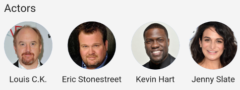
Basically the only different thing here is that the list items are now CircleAvatars, with the actors names below them. Otherwise it’s all the same here, including defining the height for the ListView in the SizedBox widget.
import 'models.dart';

class ActorScroller extends StatelessWidget {
  ActorScroller(this.actors);
  final List<Actor>? actors;

  Widget _buildActor(BuildContext ctx, int index) {
    var actor = actors![index];

    return Padding(
      padding: const EdgeInsets.only(right: 16.0),
      child: Column(
        children: [
          CircleAvatar(
            backgroundImage: AssetImage(actor.avatarUrl!),
            radius: 40.0,
          ),
          Padding(
            padding: const EdgeInsets.only(top: 8.0),
            child: Text(actor.name!),
          ),
        ],
      ),
    );
  }

  @override
  Widget build(BuildContext context) {
    var textTheme = Theme.of(context).textTheme;

    return Column(
      crossAxisAlignment: CrossAxisAlignment.start,
      children: [
        Padding(
          padding: const EdgeInsets.symmetric(horizontal: 20.0),
          child: Text(
            'Actors',
            style: textTheme.subtitle1!.copyWith(fontSize: 18.0),
          ),
        ),
        SizedBox.fromSize(
          size: const Size.fromHeight(120.0),
          child: ListView.builder(
            itemCount: actors!.length,
            scrollDirection: Axis.horizontal,
            padding: const EdgeInsets.only(top: 12.0, left: 20.0),
            itemBuilder: _buildActor,
          ),
        ),
      ],
    );
  }
}
The CircleAvatar widget comes in really handy. Even if we don’t have an image to show, we can show the actors initials in it using the child property.
Wrapping it up
One of the few downsides of Flutter is that there’s no layout DSL. This can sometimes result in ugly, hard to read UI code.
Thankfully, we can combat this by extracting our UI components to separate classes, methods and variables when appropriate. I’ve started extracting code to at least variables if not methods if I see too much indentation for my taste.
On the other hand, I’m fairly confident that there’s no UI that can’t be built with Flutter. Only Sky’s the limit.
16 comments
likes